Dream Resort Hotels Dynamic Dashboard
Note: The final interactive dashboard and its individual sheets are publicly available here.
Table of Contents
1. Introduction
The client for this project is a hotel group specialized in the vacation market. They operate several hotels and rooms worldwide. However, the general performance information of the group is not properly organized. Consequently, they need a functional and interactive dashboard displaying the main KPIs and the most relevant information to streamline the operations of the company.
Notes:
- This article presents a technical explanation of the development process followed in the project.
- Final dashboard and its individual sheets are publicly available here.
- You can also download the data source hotels.csv used in this project.
2. Objectives
The main objective is to create a functional and interactive dashboard for the company. This will enable managers to organize hotel information effectively and operate in a more data-driven manner. Tableau Public software is used for this project.
3. Project Design
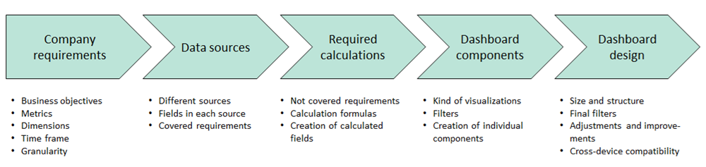
For the design of this project, we have followed a straightforward methodology, summarized in the following image. The initial time invested in creating this methodology plan will help us to organize the information properly and to present a more complete and valuable final dashboard. Additionally, this methodology will also help to optimize time and resources in the implementation of the dashboard.
3.1 Company requirements
The goal in this first and fundamental step is to determine the requirements and the scope of the project. To achieve this, some meetings are organized with the management team of the hotel group to understand their expectations, the business problematics they face, the KPIs they want to measure, the desired time frames, and other relevant details for the good performance of the company. A summary of the questions posed to the management team and its feedback are presented bellow.
- To have a single report containing the main data necessary for hotel management.
- To view current data as well as trends over the last few months.
- To ensure that the entire management team uses the same data and shares the same metrics.
- Turnover
- Number of reservations
- Occupancy rate
- ADR (Average Daily Rate)
- RevPAR (Revenue per Available Room)
- Cancellation rate
- All of the above metrics with the ability to select specific dates for data consultation.
- Evolution of the occupancy rate for the last 6 months.
- Turnover and number of reservations categorized by the customer’s country and how all the metrics are affected by country selection.
- The longest possible history according to the available data.
- For the values of all the mentioned metrics, we want to select specific dates for data consultation.
- For the evolution of the occupancy rate over the last 6 months, we only want to visualize the available data for that period independently of the selected dates in the filter.
3.2 Data sources
In the second step of the project design, the goal consists of identifying the data sources. How many data sources are available, where are they located, what information is available, which files need to be modified, and so on. In this case, the data provided by the company is contained in a single comma-separated values text file called hotels.csv.
This file directly contains the information of two of the metrics required by the client: the number of reservations and the ADR.
3.3 Required calculations
In the third step, we identify the requirements specified by the management team that are not directly available in the data source. The necessary new information is calculated according to the following table.
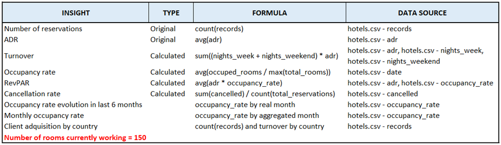
These calculations will ensure that all necessary metrics are available for the dashboard, providing comprehensive insights for the management team.
3.4 Dashboard components
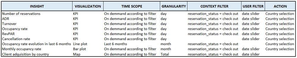
In this step, the most appropriate visualizations are chosen for each insight, along with the relevant filters and actions. This information is summarized in the following table.
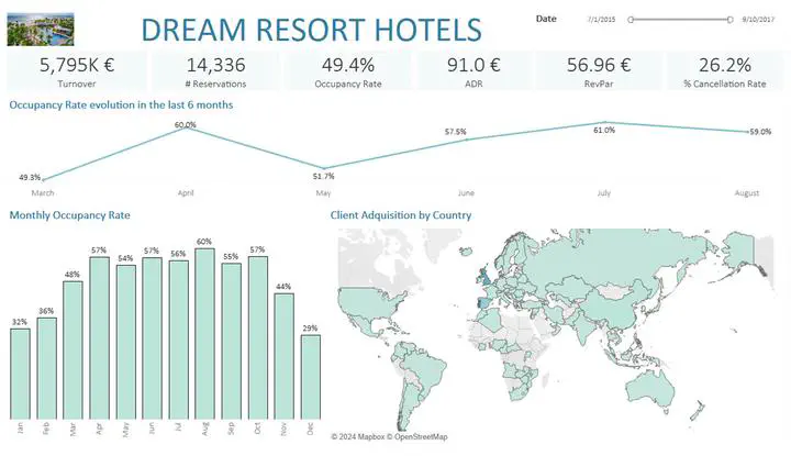
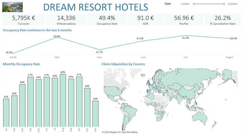
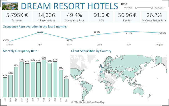
A band containing all the KPIs is created and located at the top of the dashboard. These are the most valuable metrics, which are used to present the main performance information of the company.

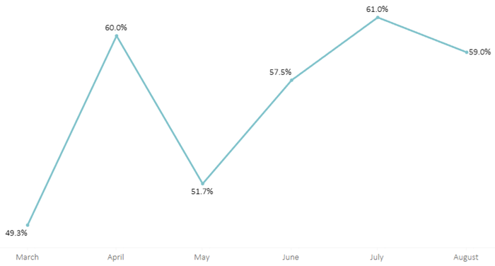
The occupancy rate evolution in the last 6 months is presented through a line plot and located under the KPIs band. Notice that this dashboard component is not affected by the date slider, since we are presenting the whole information during the 6 most recent months.
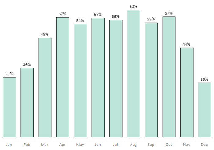
The seasonality is analysed through the monthly occupancy rate. A component for this metrics is created using a bar plot and located in the left corner under the occupancy rate evolution.
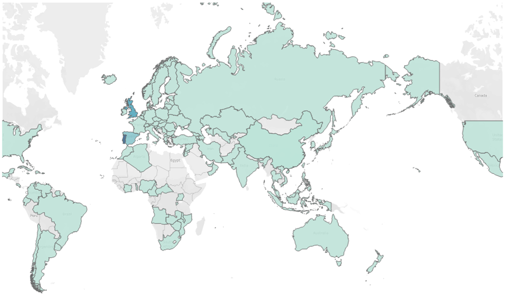
Finally, the distribution of the clients is presented in a map. This component is located at the right corner under the occupancy rate evolution and next to the monthly occupancy rate. Notice that this component is also used as a filter for the rest of the performance indicators through an action order.
3.5 Dashboard design
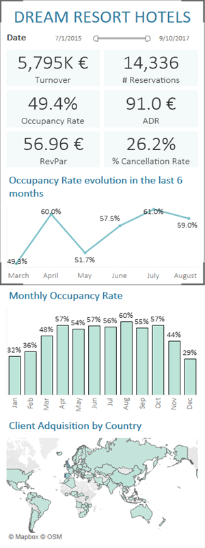
In the final step, the dashboard design is addressed. The size and structure of the dashboard are defined, ensuring compatibility with different devices such as desktops, tablets, and phones. The data filter is located at the top right corner of the dashboard, and some additional decorative elements are included for a more polished presentation. The final dashboard versions are presented bellow.
The final interactive dashboard and its individual sheets are publicly available here.
Pablo Esteban
Data Scientist and PhD in Mechatronics. I’m passionate about solving problems and optimizing processes, especially those related to coding and business knowledge.